Strategy
Create a strong relationship with the customer doing interactive game or poll, to make them play with Milka and keep the chocolate brand in all minds.
Target:
The brand appeals to the childish imagination and is focused on the fairytale for adults.
The core target is adults and young adults from 20 to 45 years old with no differentiation by gender or CSP. Milka affects particularly gourmands who search quality and pleasure. It’s a tender experience to find pleasure and softness in everyday life moments.
The fundamental image of Milka derives from the theme ‘most tender chocolate which melts in the mouth and which is also ‘tender to the soul’. Milka’s brand values and outlook are also based on innocence, feeling young at heart, being able to look at the world through the eyes of a child, using imagination to enlighten the world, and being optimistic, mischievous and cheerful. It is these characteristics of Milka that soften the hearts of consumers, making them feel young at heart and putting a smile on their faces.
Positioning:
Milka positioning is first of all associated with its history.
- Milka was the first to introduce milk chocolate on the French market. The brand does not hesitate to highlight the benefits and quality of its milk based on an authentic food processing.
- The specificity of Milka is characterized by its original purple color, which is easily recognizable.
- In 1984 it was rather focused on temptation with the slogan ”Milka, la plus tendre des tentations depuis que le chocolat est né”. This positioning reflected the characteristics of a tender product and different consumer expectations. Indeed, the consumer eats chocolate as a desired product for which he can succumbs only from time to time, creating the concept of frustration.
- While in 1991, positioning focuses on tenderness, humor and mystery. The ads highlight the secrets of making chocolate Milka, giving it a magical aspect, supplying the imaginary consumer need. The slogan is now “Milka, tendrement chocolat” “, taking the characteristic product, always playing on the emotion aroused.
- Today, the brand relies on more than just greed and tenderness with slogans: “Milka dare extra greedy” and “Milka, osez la tendresse.” The concept of frustration has disappeared. The brand is now targeting its proximity to consumers and seeks sharing. You might have heard of this pub telling the story of this “purple cow which was very good at bringing people together, and each time she was there, she was just a little softer.”
Values:
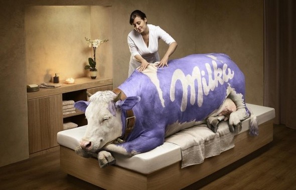
Through the mountain landscape and the purple cow, Milka wants to emphasis on the value of nature and authenticity. Those values also implies simplicity, family, childhood, gentleness, friendliness, reflect humor and tenderness of the anthropomorphic publicity.
Evolution of values:
- At the beginning, Milka promises a traditional, authentic and high quality product to the consumer. These concepts are reinforced by the use of the cow, the presence of the Alps (Swiss chocolate).
2.Then, Milka promises tenderness and love to its consumers. The cow, representing a symbol of the foster mother and animals carefully preparing products, reinforces those values. Through its last slogan, Milka invites consumers to “Osez la tendresse.” The brand invites consumers on platform to send sweet words to their friends, lovers, acquaintances etc.., through the Milka cow.
3.Finally, when you eat a chocolate Milka you eat a bit of mystery. You probably saw the advertisement in which we can hear: “Why milk chocolate Milka is so tender?” And a woman’s voice answers: “It’s a little intrusive” Or in another add, we can see animals making chocolate.
Packaging:
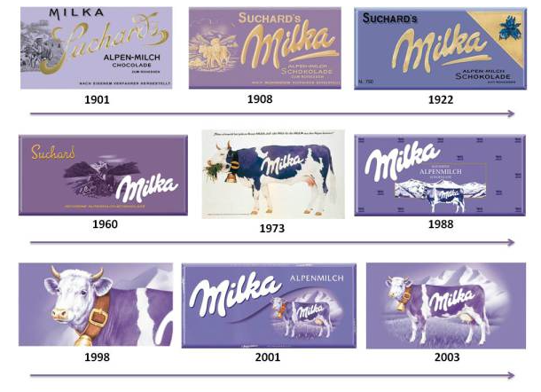
Milka has understood this principle and launched its ” Milka Cow ” in 1901 on packaging.
The cow represents the alpine’s world and milk. As for the color purple, the company is based on the diction ” familiarize yourself with what is foreign, become foreign for the familiar ” to draw attention to his chocolate while evoking the sweetness, and tenderness. It is clear that the purpose is to unite people around the brand, to bring consumers to a product even inspiring friendliness, family and sports spirit.
Ludivine Lions
Sources:
http://milkavslindt.wordpress.com/2013/11/08/the-brand-assets/
http://chocolatebrands.blogspot.fr/p/milka.html
http://www.superbrands.com/turkeysb/trcopy/files/milkaing_3904.pdf


